Batch 01
-
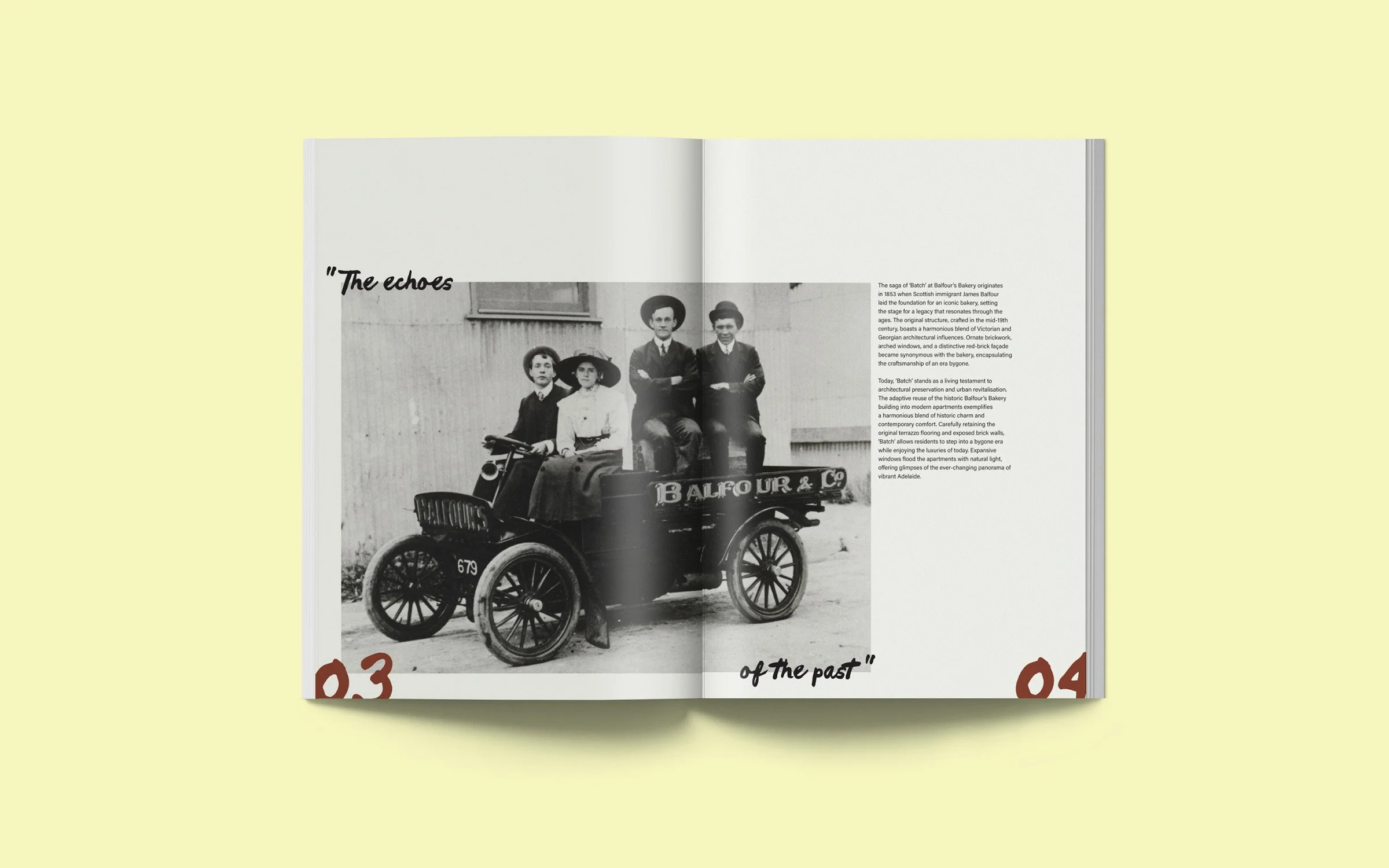
Batch is a luxury residential development located on the former site of a historic bakery. The identity translates the site’s legacy of craftsmanship into a contemporary brand system rooted in restraint, tactility, and modern refinement. Subtle references to process, materiality, and care inform a visual language that honors history without nostalgia.
-
Brand & Editorial Designer
Led the development of Batch’s identity, translating the historical bakery legacy into a refined, contemporary brand system. Responsibilities included strategic concept development, visual research, typography and color exploration, and editorial design that reinforces tactile and narrative qualities.
Tools: Adobe Illustrator, Adobe InDesign, Adobe Photoshop
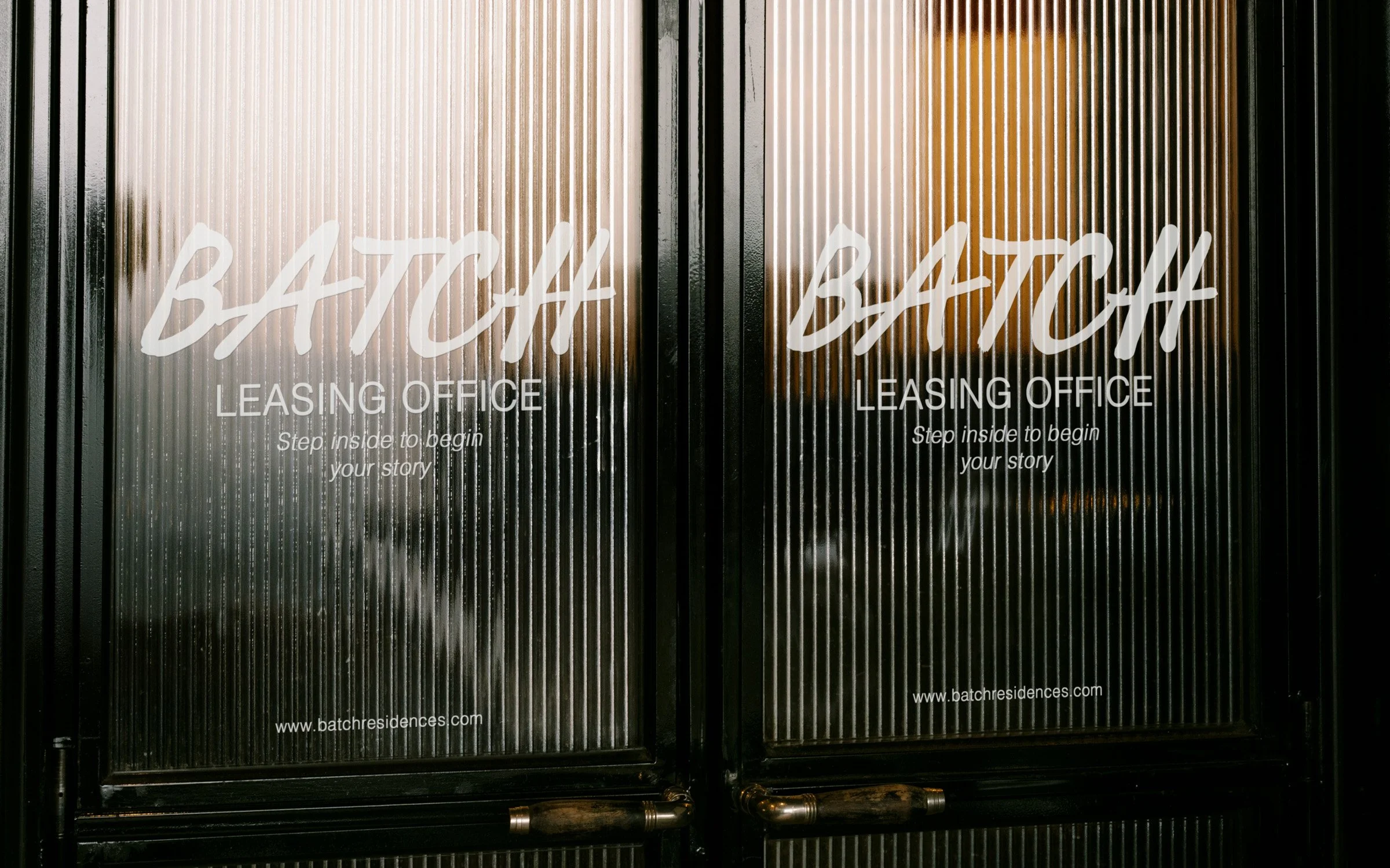
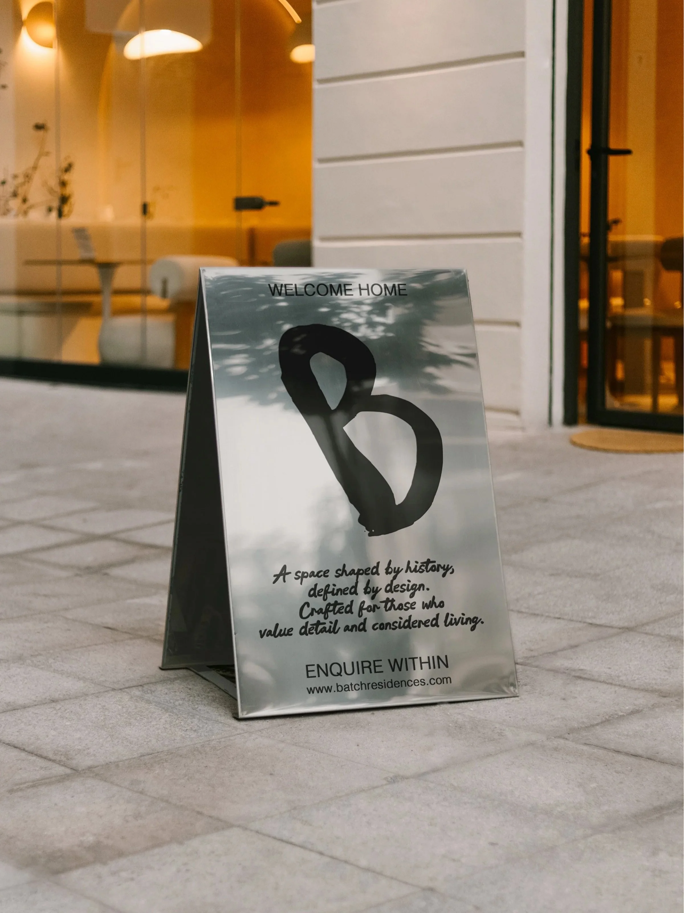
Deliverables: Brand identity system. color palette, typography direction, editorial layouts, book cover design, visual guidelines, outdoor signage, environmental applications
-
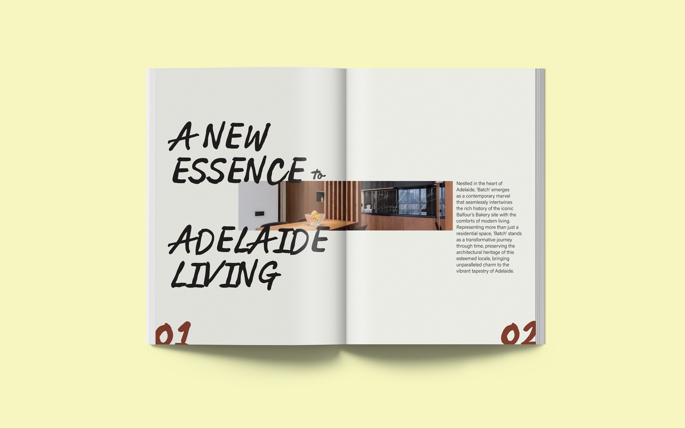
Batch occupies the grounds of what was once a well-known bakery, presenting an opportunity to explore how history can inform a contemporary residential identity without overt reference. rather than replicating the visual language of baking, the project focused on translating its underlying values — craftsmanship, care, and intentionality, into a refined brand system.
The central challenge was balance: how could warmth and tactility associated with a baker’s process be felt through abstraction within a modern, design led context?
Early exploration was guided by keywords such as artisan, delicate, natural, and modern, leading to a concept framed as “crafted with the same care as a baker’s touch”. This idea informed decisions across color, typography, and material expression.
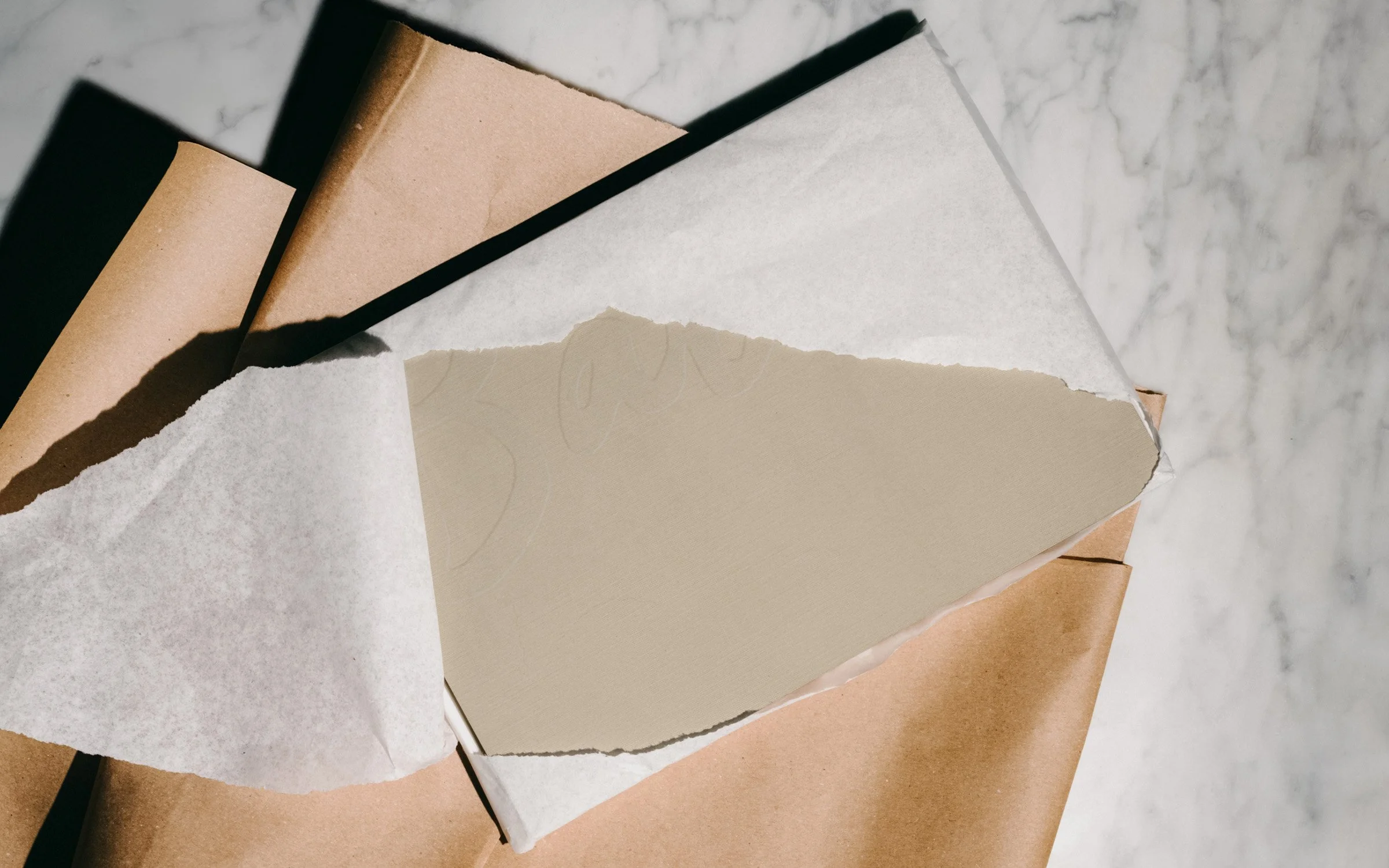
The color palette draws from the baking process itself, moving between pale yellow and a warm brown tone that evoke transformation from ingredient to finished product. These references were softened and neutralized to maintain an understated, natural palette suitable for a luxury residential environment.
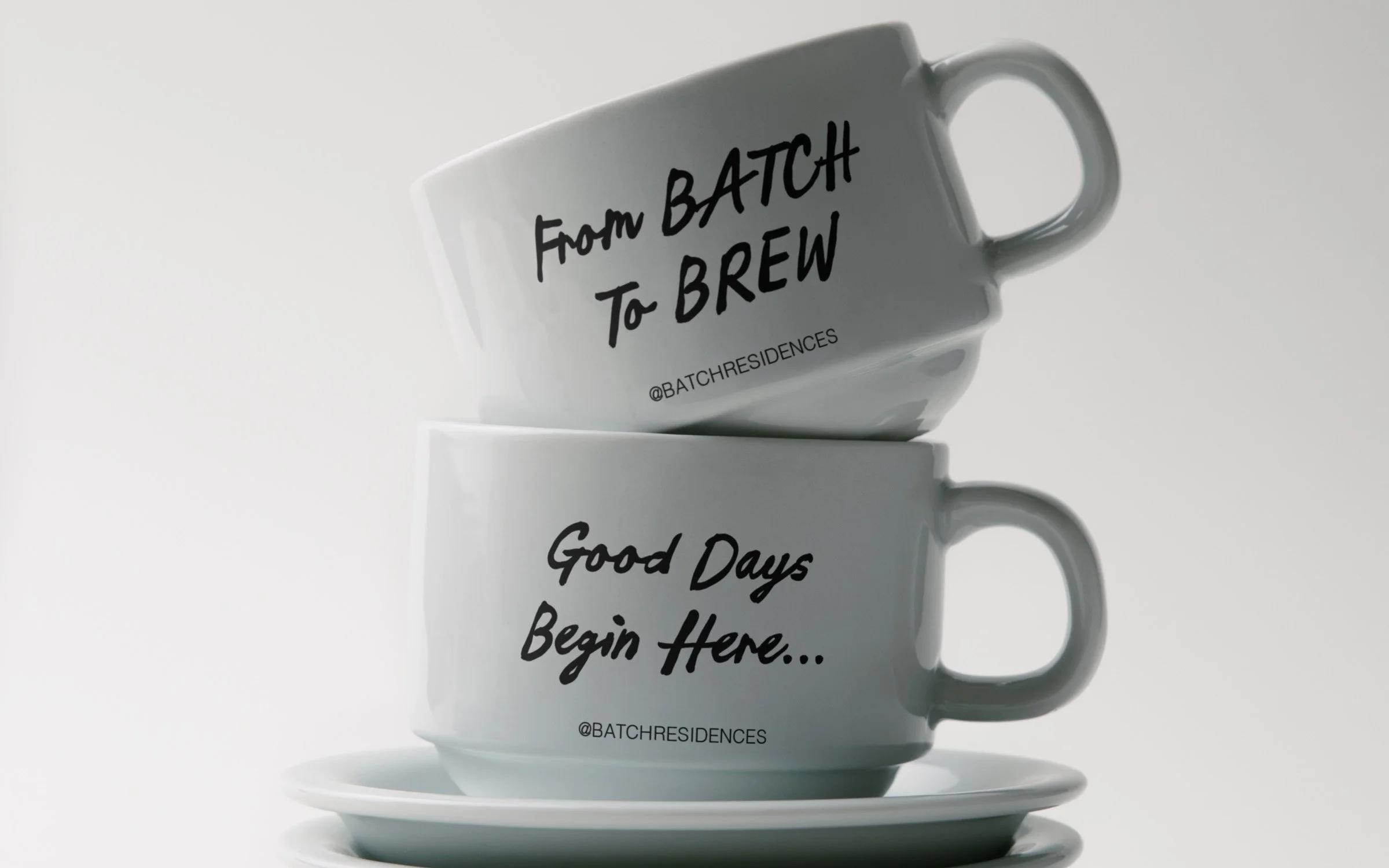
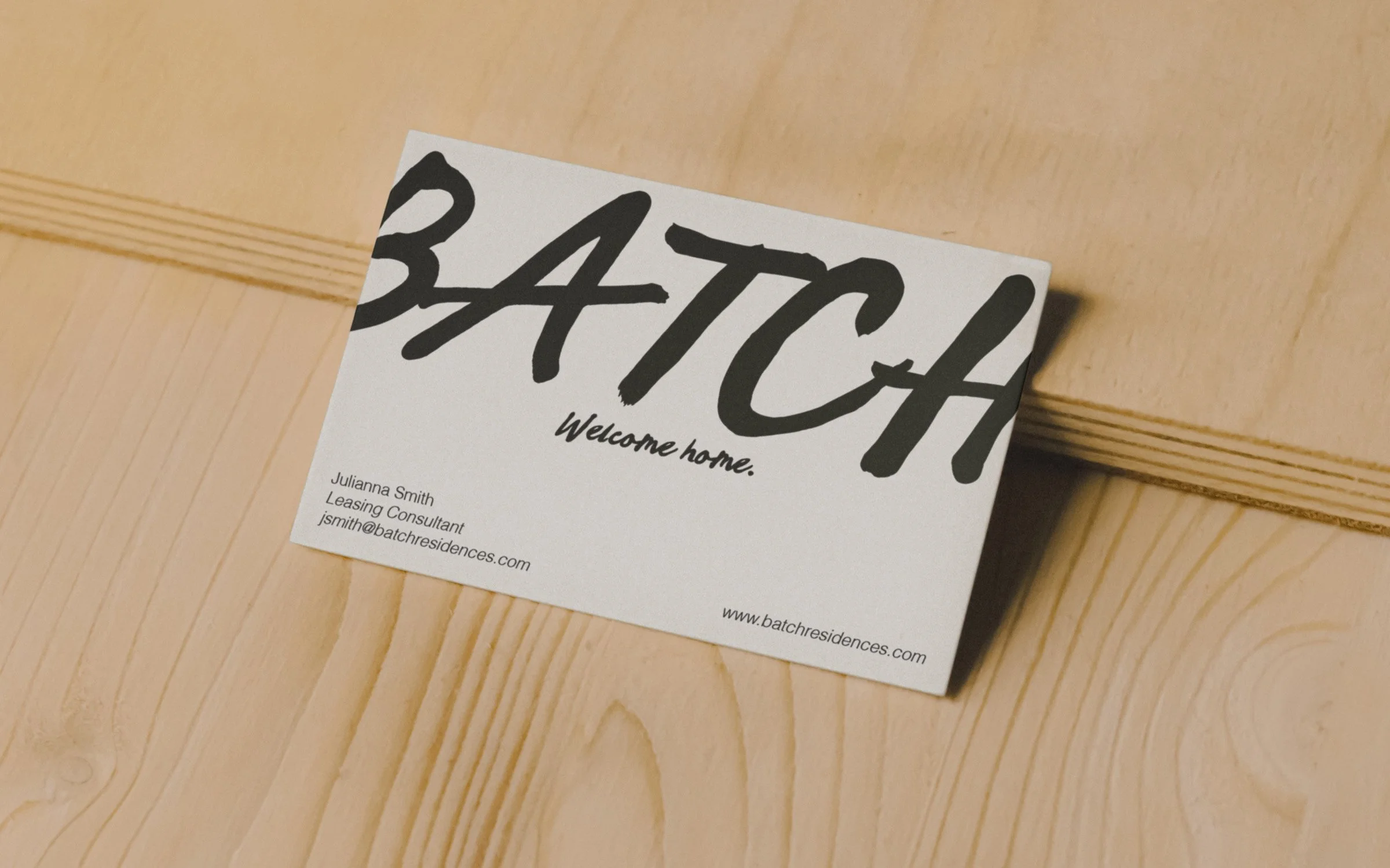
Typography balances human warmth with contemporary clarity. A handwritten-inspired typeface introduces individuality and tactility, while its bold, modern construction ensures confidence and legibility across brand applications.
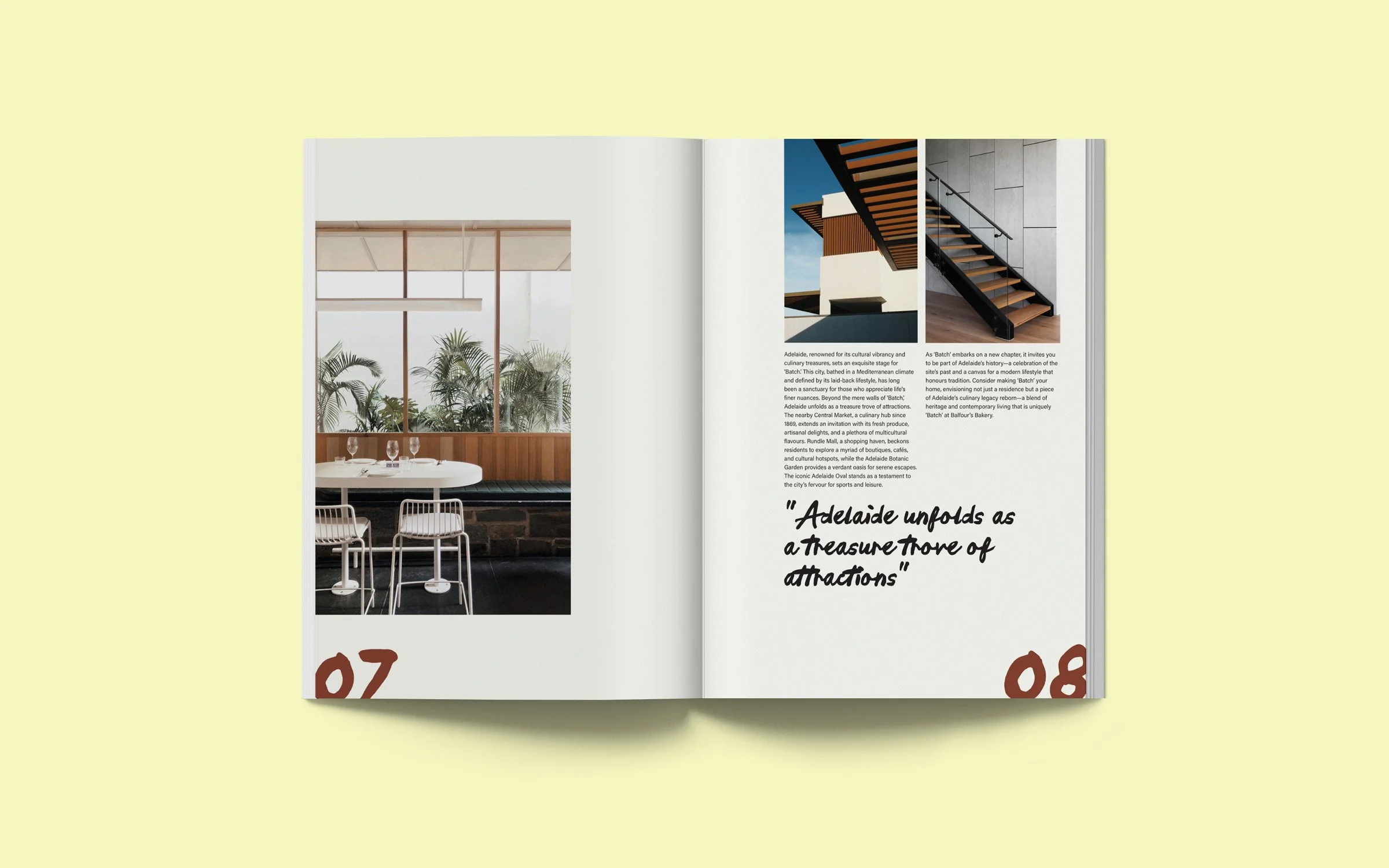
The editorial system was designed around hierarchy created through balance and tension. Clean layouts allow photography to lead, reinforcing atmosphere and material detail without excessive framing. The book cover distills the brand’s tactile qualities through a linen texture and minimal composition, with the Batch wordmark bleeding off the edge — a subtle expression of scale, confidence, and modern restraint.
The resulting identity forms a cohesive system that quietly bridges past and present, allowing the site’s history to inform the brand through suggestion rather than statement.