Aurora 04
-
Aurora is a neurodiversity coaching company, positioning difference as a source of strength, creativity, and impact. The identity visualizes the beauty of diverse thinking through transformational typography, dynamic color gradients, and expressive photography, creating a brand that is expansive, comforting, and empowering.
-
Brand & Visual Identity Designer
Developed a brand identity for a neurodiversity coaching company, emphasizing the power of thinking differently as a source of strength and creativity. Led typography exploration, color strategy, photography treatment, and the design of branded collateral to reflect transformation, individuality, and empowerment.
Tools: Adobe Illustrator, Adobe Photoshop, Adobe InDesign
Deliverables: Logo and secondary mark design, typography for identity, color gradient system, poster series with photographic treatment
-
Aurora seeks to reframe neurodiversity as a powerful advantage, emphasizing that thinking differently is a strength, not a limitation. The design challenge was clear: How can a visual identity convey both individuality and collective strength, while remaining welcoming, clear, and inspiring?
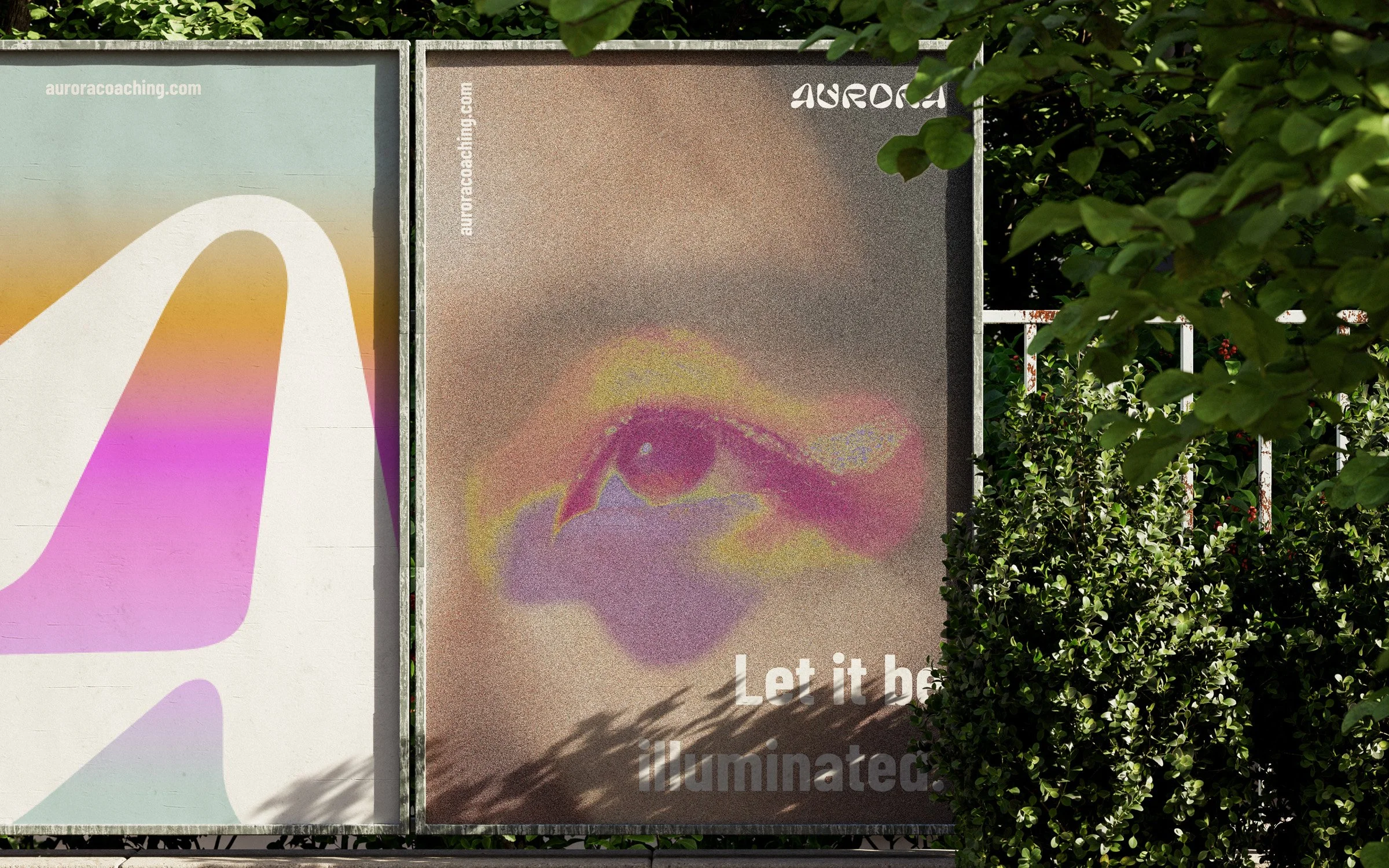
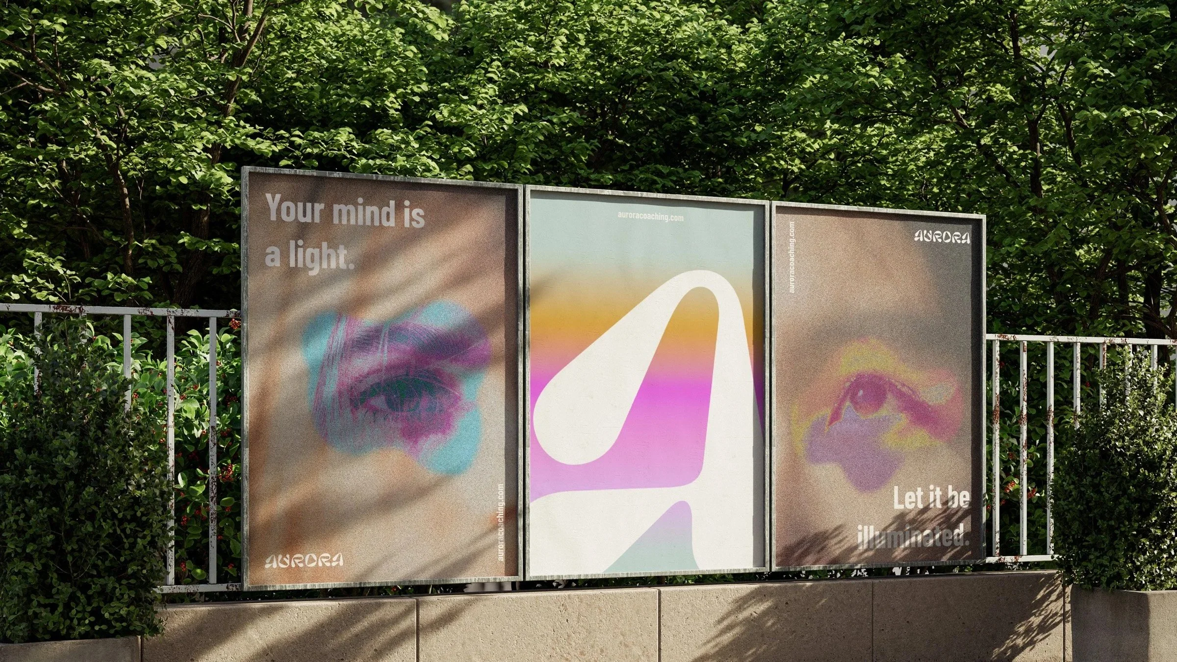
The core concept celebrates the mind’s diversity as a source of color and creativity. Typography became a central tool — the logo typeface is soft yet transformational, with subtle movement in each letter that visually represents difference and individuality. The “a” of Aurora serves as a secondary mark, versatile across future applications, highlighting the identity’s playful and adaptive qualities.
Color is central to the narrative. Gradients were employed to evoke expansiveness, warmth, and fluidity, reflecting the spectrum of thought and expression within neurodiverse minds. Photography complements this, with close-up images of eyes where color radiates outward — a visual metaphor for inner strength, perspective, and the impact of thinking differently.
Through this approach, Aurora’s identity is transformational and human-centric, creating a brand that feels dynamic, inclusive, and optimistic — an identity designed to make difference visible, tangible, and celebrated.