Counter Culture 03
-
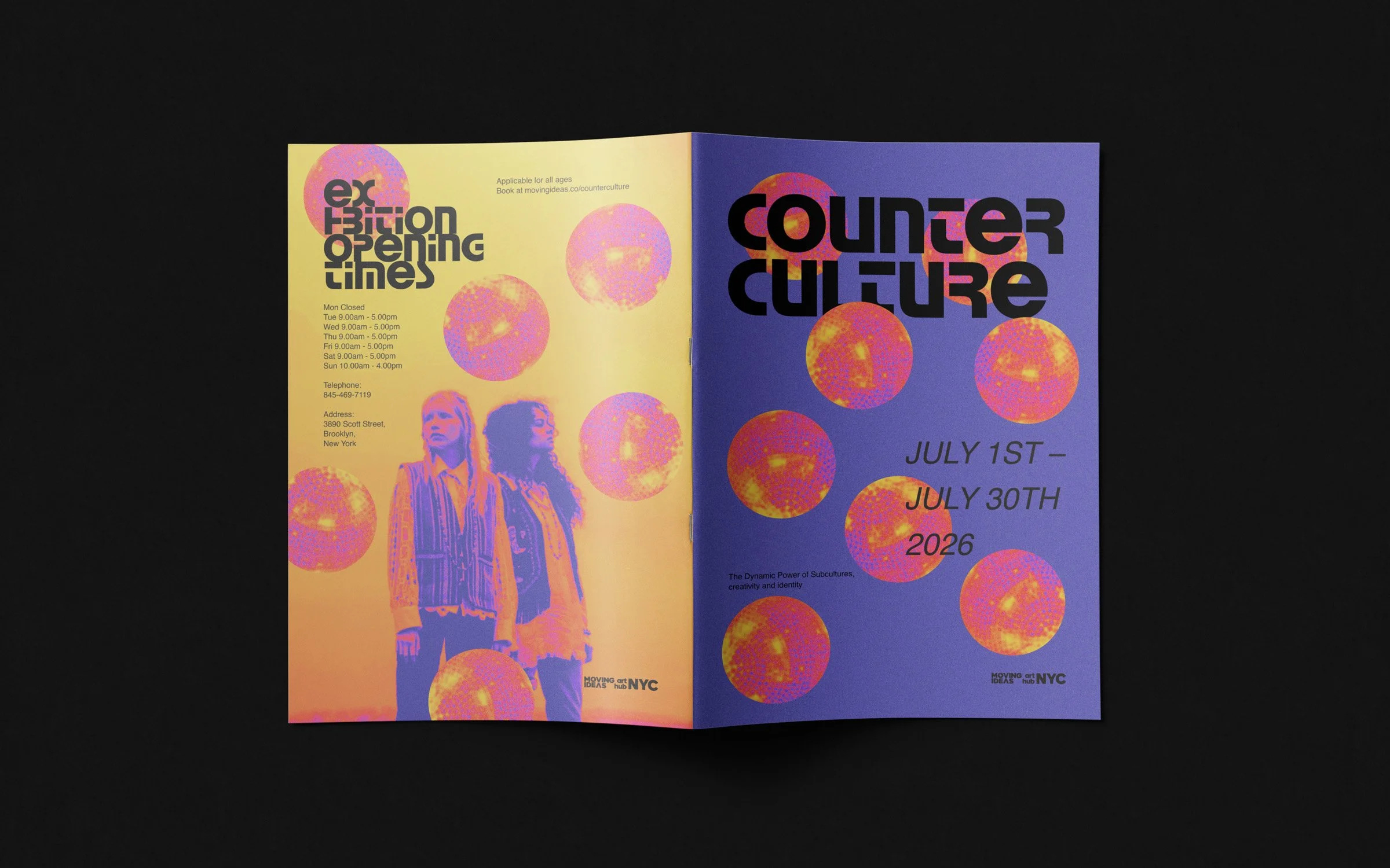
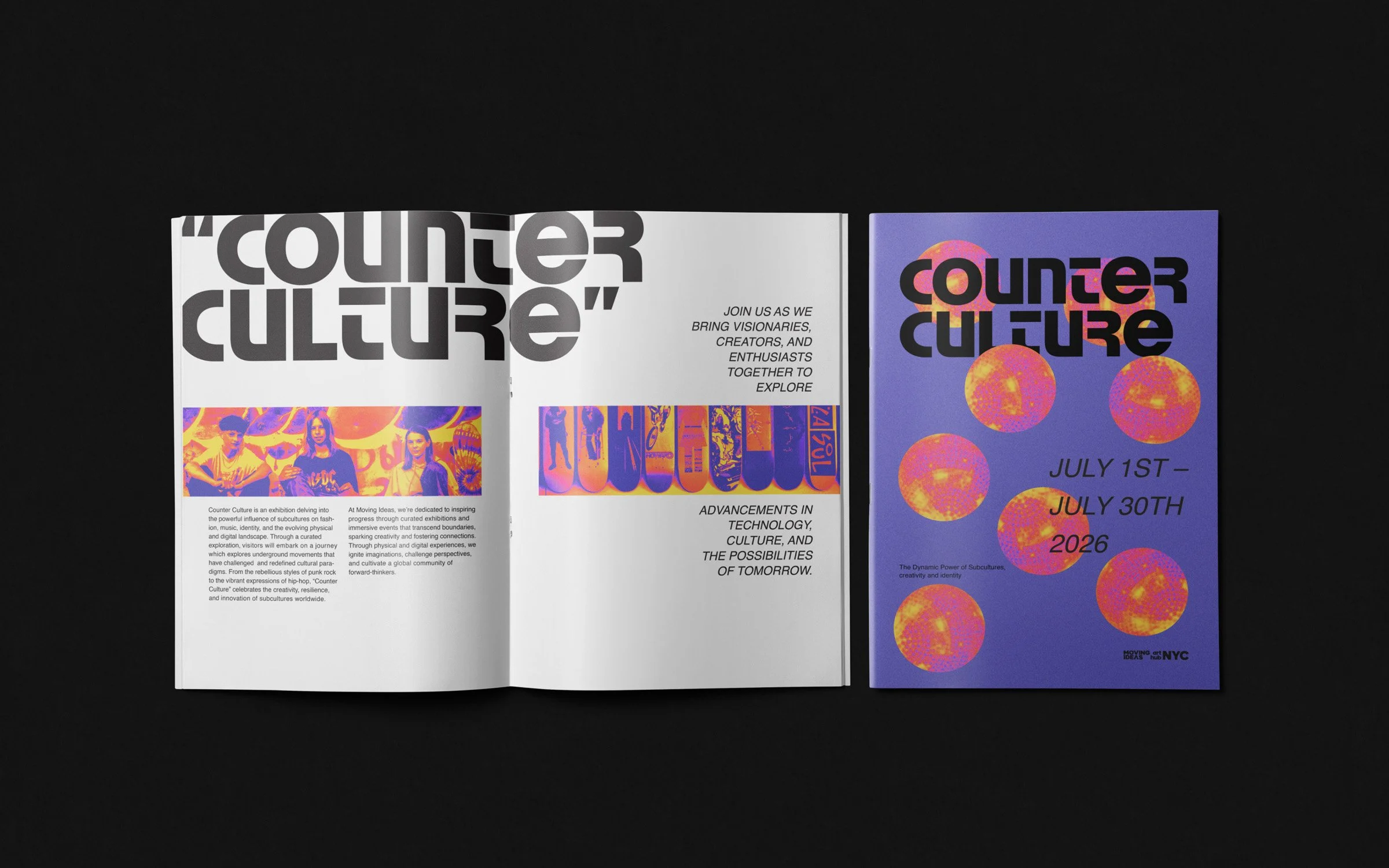
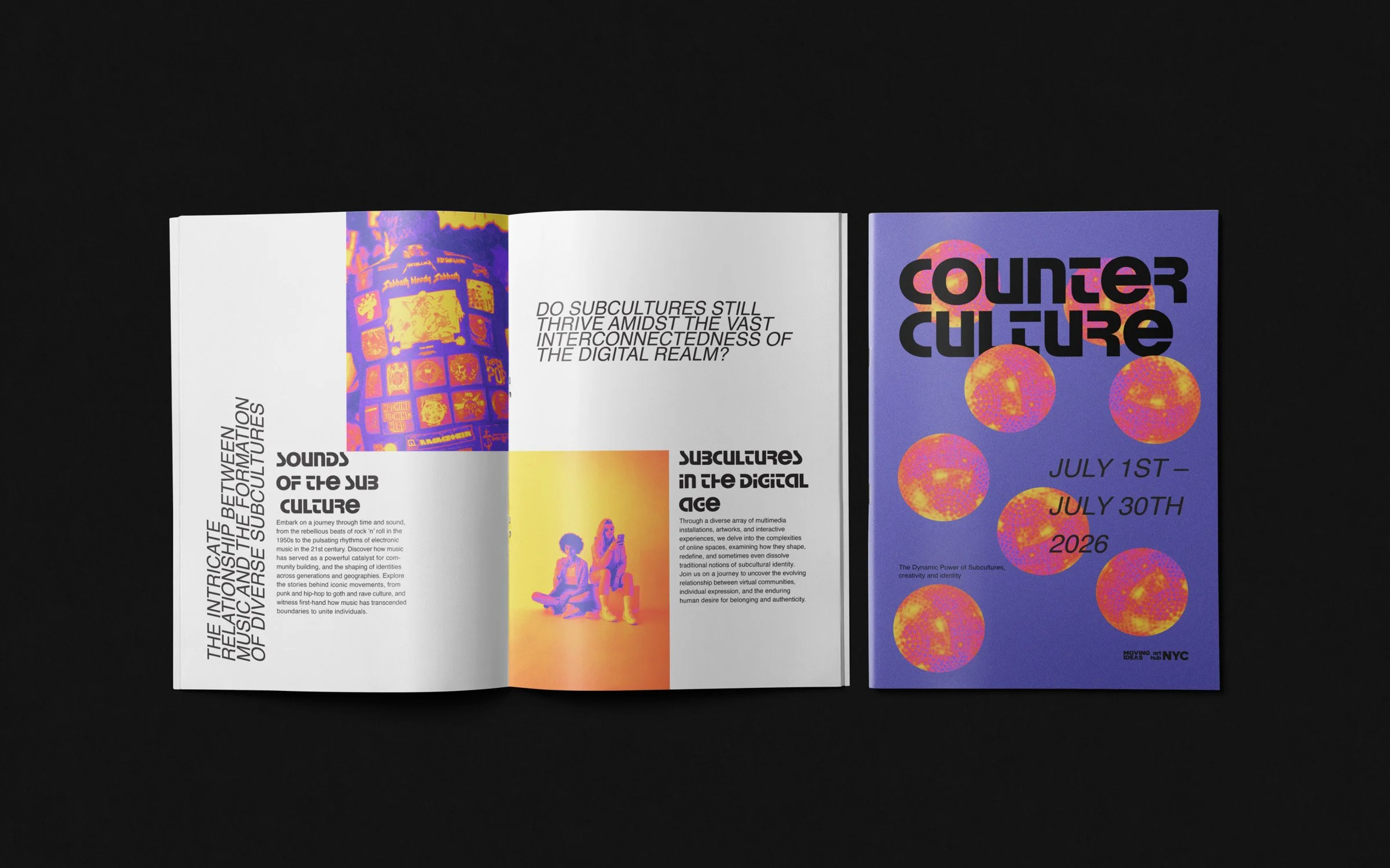
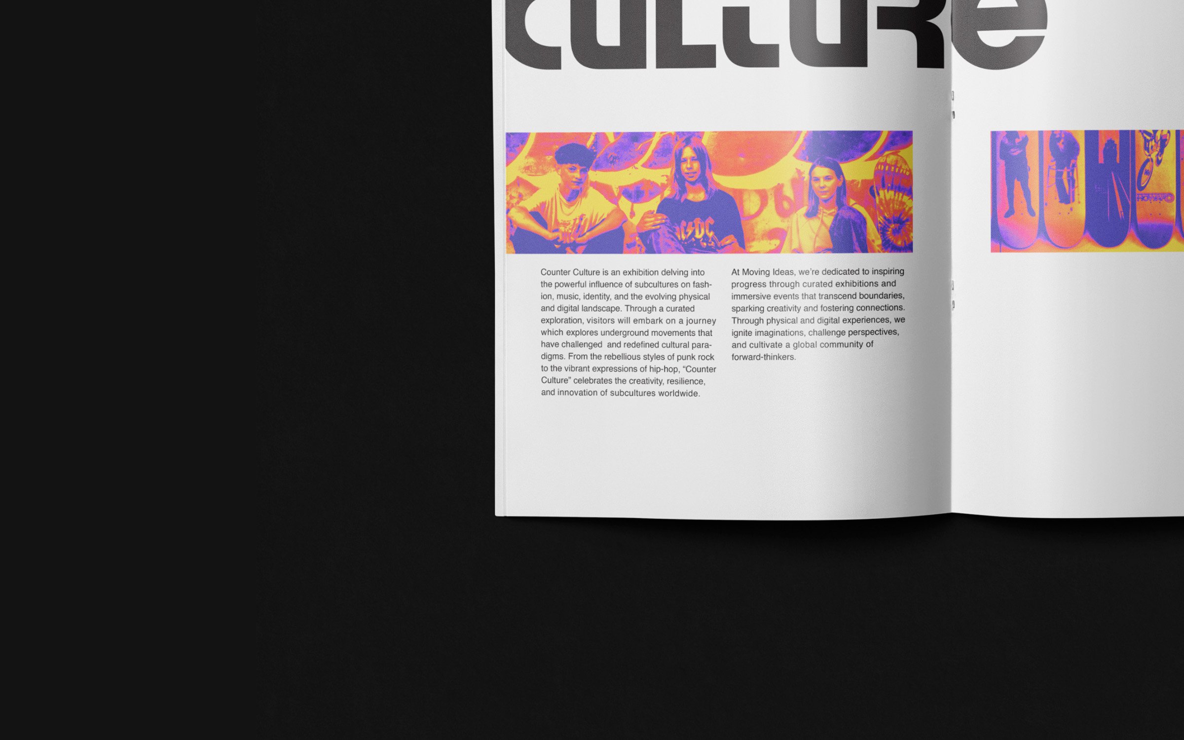
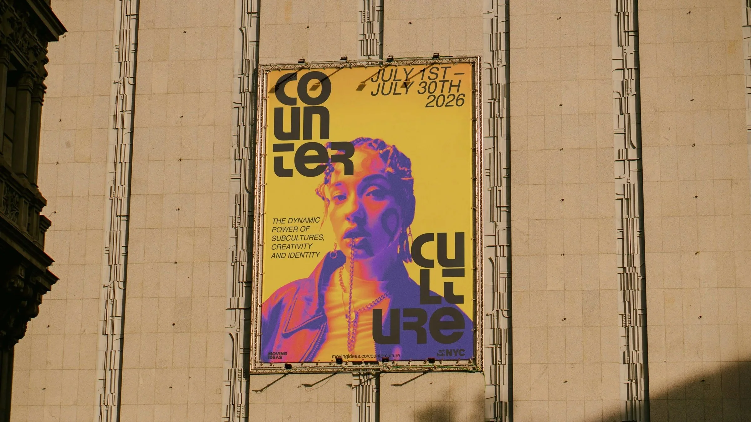
Counter Culture is a festival celebrating cultural differences and shared human experiences. The brand explores boundless creativity and human interconnectedness through editorial design, using thermal-inspired color ideation to visualize the spectrum of individuality. Every element communicates a narrative of unity, diversity, and collective imagination.
-
Brand & Editorial Designer
Led concept and visual execution for a festival celebrating cultural diversity, translating abstract ideas of connection and individuality into a thermal inspired editorial system. Responsibilities included color strategy, photography treatment, layout design, and creating immersive print collateral that communicates the festival’s conceptual narrative.
Tools: Adobe Illustrator, Adobe InDesign, Adobe Photoshop
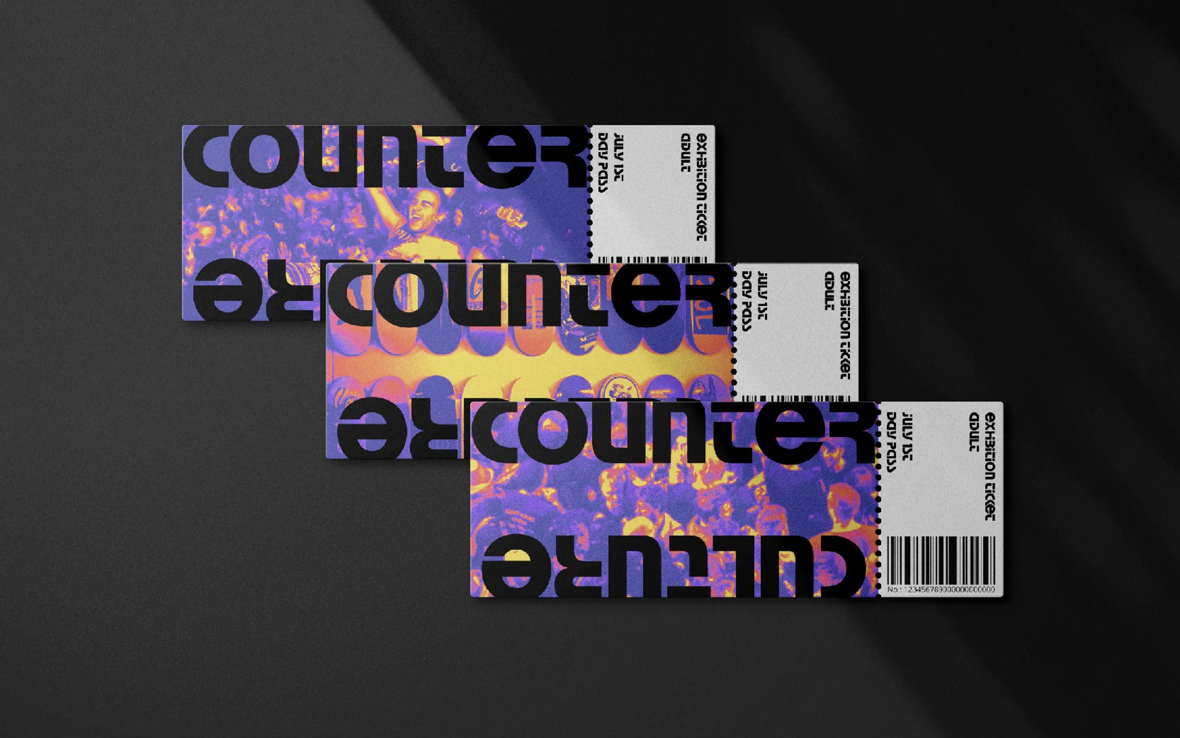
Deliverables: Festival brand concept, thermal editorial system, brochure book design, event ticket design, photography editing and color treatment
-
Counter Culture sought to create a festival identity that would celebrate diversity while emphasizing the common humanity that unites us. The central design challenge was this: How can a visual system honor the richness of individual differences while conveying a sense of connection, energy, and shared experience?
The core concept, “Nebular in imagination”, frames the festival as a space where ideas, cultures, and perspectives converge to generate something greater than the sum of its parts. To visually translate this, I led the design through thermal color ideation, a metaphor for human diversity and interconnection. Every editorial image was processed to reveal a spectrum of thermal energy — like an x-ray of human presence — illustrating that beneath our individual differences, we all radiate the same humanity.
This approach creates a layered, vibrant identity. Thermal colors become a visual language for energy, emotion, and expression, while editorial layouts are structured to guide the eye through this dynamic spectrum. The palette, texture, and motion combine to make the invisible visible — showing the festival’s conceptual depth in every printed and experiential touchpoint.
Through this system, Counter Culture’s identity is experiential and conceptual, inviting audiences to not just observe but feel the collective warmth and vibrancy of cultural diversity.